Case Study

MetLife


Overview

MetLife was going through a rebrand and rethinking their entire UX and UI frameworks. Alongside the team at Cake&Arrow, we developed a completely new system for their small business insurance product. It included a direct-to-consumer portal and agent portal, both responsive. With user testing, intense prototyping and a fast timeline, we designed the new site and web app in less than 4 months.


Client

MetLife

Date

2017

My Role

Lead UI Design

Team

Shan Liu, UI Designer
Dafna Alsheh, Lead UX Designer
Ed Samour, Team Lead
Jess Lippke, Producer and Project Manager
Audrey Henik, Product Manager

Project Website

https://www.metlife.com/

As part of a full brand refresh, MetLife wanted to redesign their small business insurance site.

After researching and auditing their existing site, we started with a new user flow.

Jake Kahana UX Metlife
 

There were hundreds of screens. We mapped them out by hand and kept track of the design progress on detailed spreadsheets.

1_1Yayigprash76905UkGUMg.jpeg
 

Keeping track of files, assets, and shared libraries was a big part of our challenge.

Screen Shot 2019-10-15 at 7.20.30 AM 1.png
Jake kahana metlife ux design

We used Sketch, Google Drive, and Craft to share libraries, and keep track of version control.


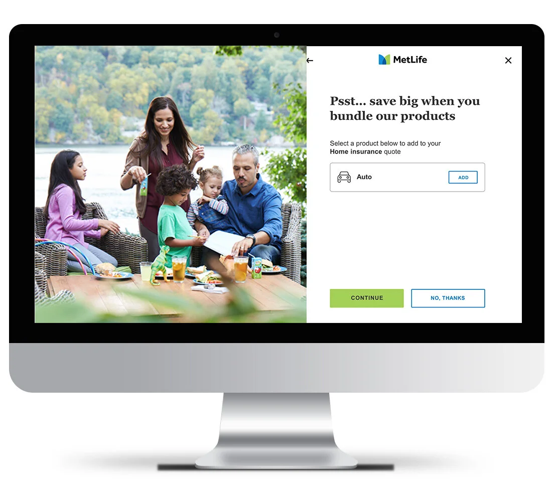
Ultimately, we ended up with a beautiful new site that streamlines userflow and optimizes generating trust-worthy quotes and increased purchases.

Jake Kahana metlife cover
Jake Kahana Metlife ux design
Jake kahana metlife design
Jake Kahana metlife design
 

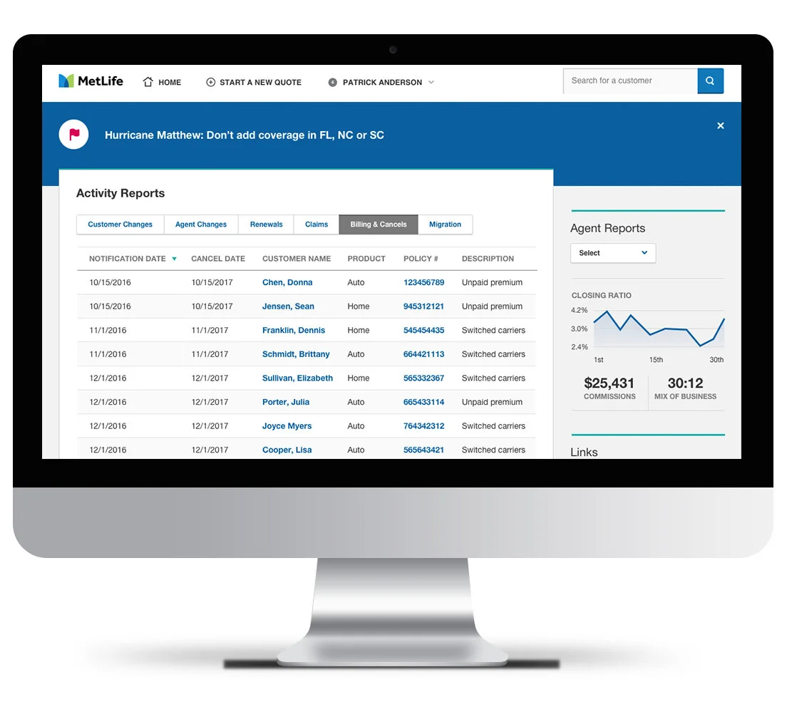
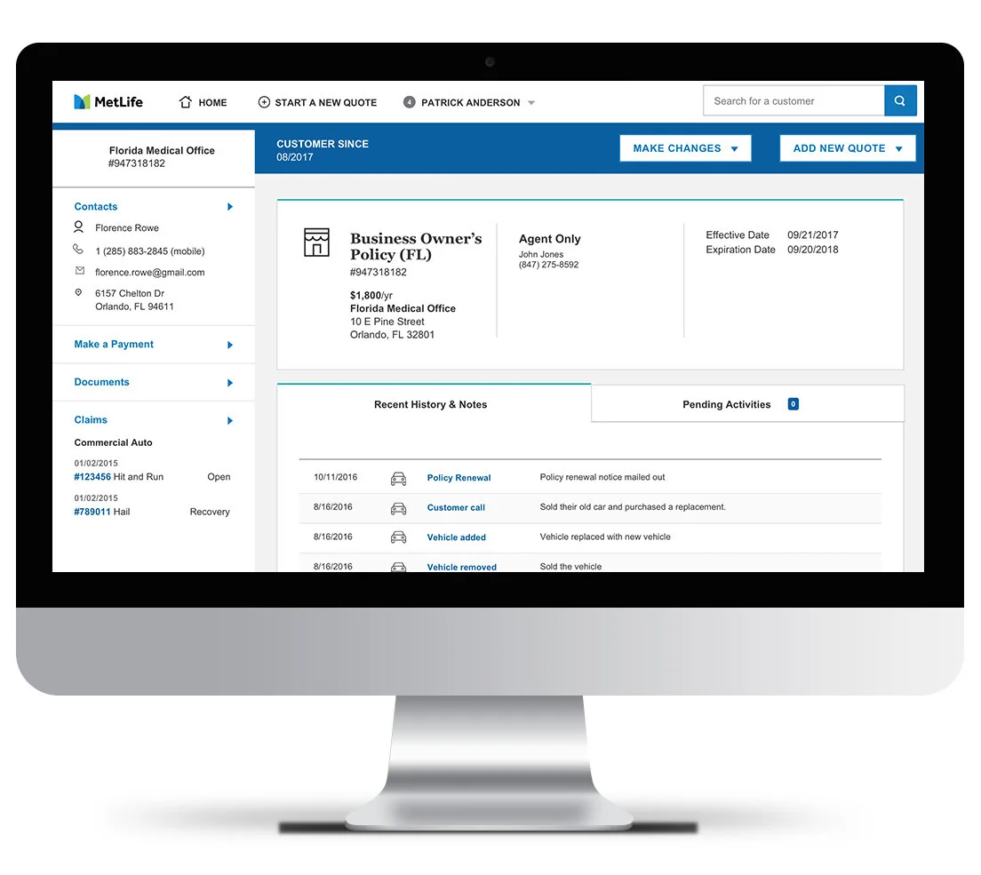
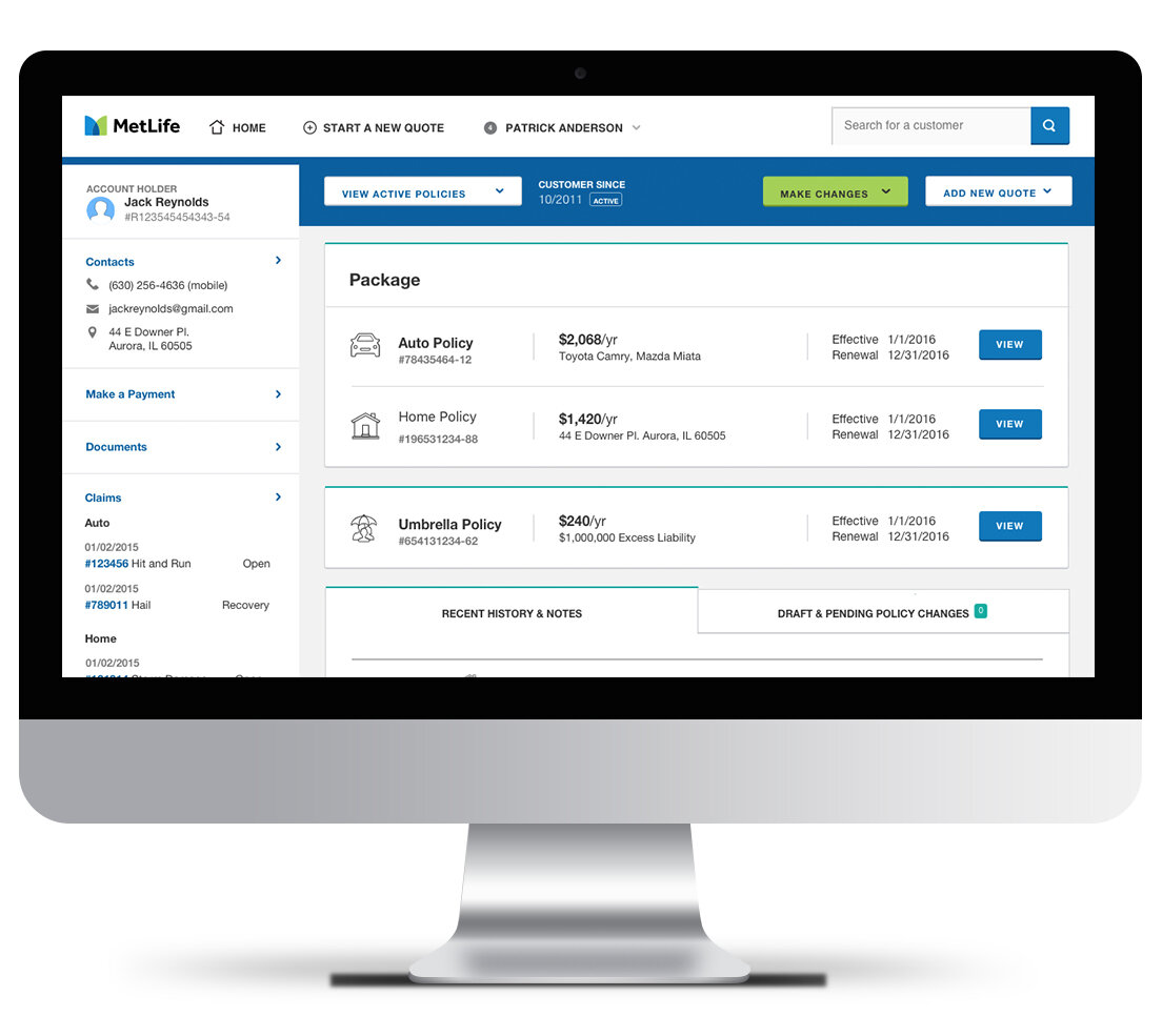
The agents’ portal took on a slightly different look and fuction.

Jake Kahana Metlife agent design
Jake Kahana metlife design
MetLife_Agent_ jake kahana design

Our MetLife team was happy with the results and even happier that it led to more engagement and usage of the small business insurance tool.